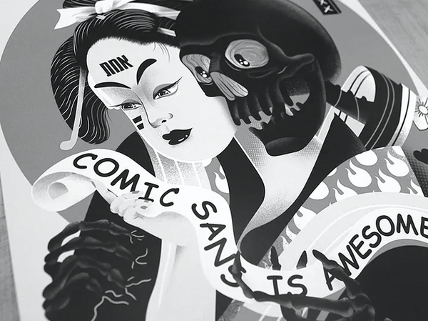
The Deep Hate for Comic Sans
Type hate isn‘t new, and Comic Sans isn‘t the only victim. In the 1970s, ITC Souvenir inspired strong negative feelings among designers. The early 1990s saw a mock hate campaign against Futura Extra Bold Condensed. But none of these attracted the same degree of sustained fury as Comic Sans.
Typographer and writer Allen Haley puts typographic hatred into historic perspective, proposing four categories to explain why typefaces are hated:
1. The design is overused
2. It‘s a copy of another typeface
3. It‘s considered poor quality
4. It‘s just hateable
Comic Sans checks at least three of these boxes. But it‘s more than just a hated font—it‘s a cultural artifact symptomatic of the digital age.
As typography scholar Karin Wagner states in her book „From ASCII Art to Comic Sans: Typography and Popular Culture in the Digital Age,“ Comic Sans is undoubtedly a typographic phenomenon whose impact extends far beyond the graphic design trade.
The discourse against Comic Sans generally falls into three main arguments:
The Usage Argument: Comic Sans is overused and used inappropriately. When it appears on serious documents, medical offices, or professional contexts, it undermines credibility and sends the wrong message.
The Aesthetic Argument: Comic Sans is ugly and violates typographic norms in terms of coherence, stroke modulation, proportion, letter fit, and other design parameters. Its irregular letterforms and inconsistent spacing offend designers‘ sensibilities.
The Sociological Argument: This is where things get interesting. Comic Sans represents amateur designers with access to desktop publishing tools they don‘t master. Professional graphic designers feel they must defend their territory, retain their cultural status as experts, and protect their position in the labor market. When everyone can choose fonts, what makes a graphic designer special?