Typography is not a neutral art form; the choice of font carries significant emotional, cultural, and historical weight. Stereotypography refers to a font that has essentially become a stand-in for a culture or identity, rather than being used as a design tool. Using a font laden with such stereotypes can have serious consequences. It can alienate your audience and flatten the histories of whole cultures into a single cliché.
Most of these stereotypical typefaces acquired their reputation at a time when Western civilization was seen as the benchmark, and everything 'other' was reduced to primitivism — either seen as fascinating or inferior. The following paragraphs will delve into the particulars of some of the fonts that came into being during this era.
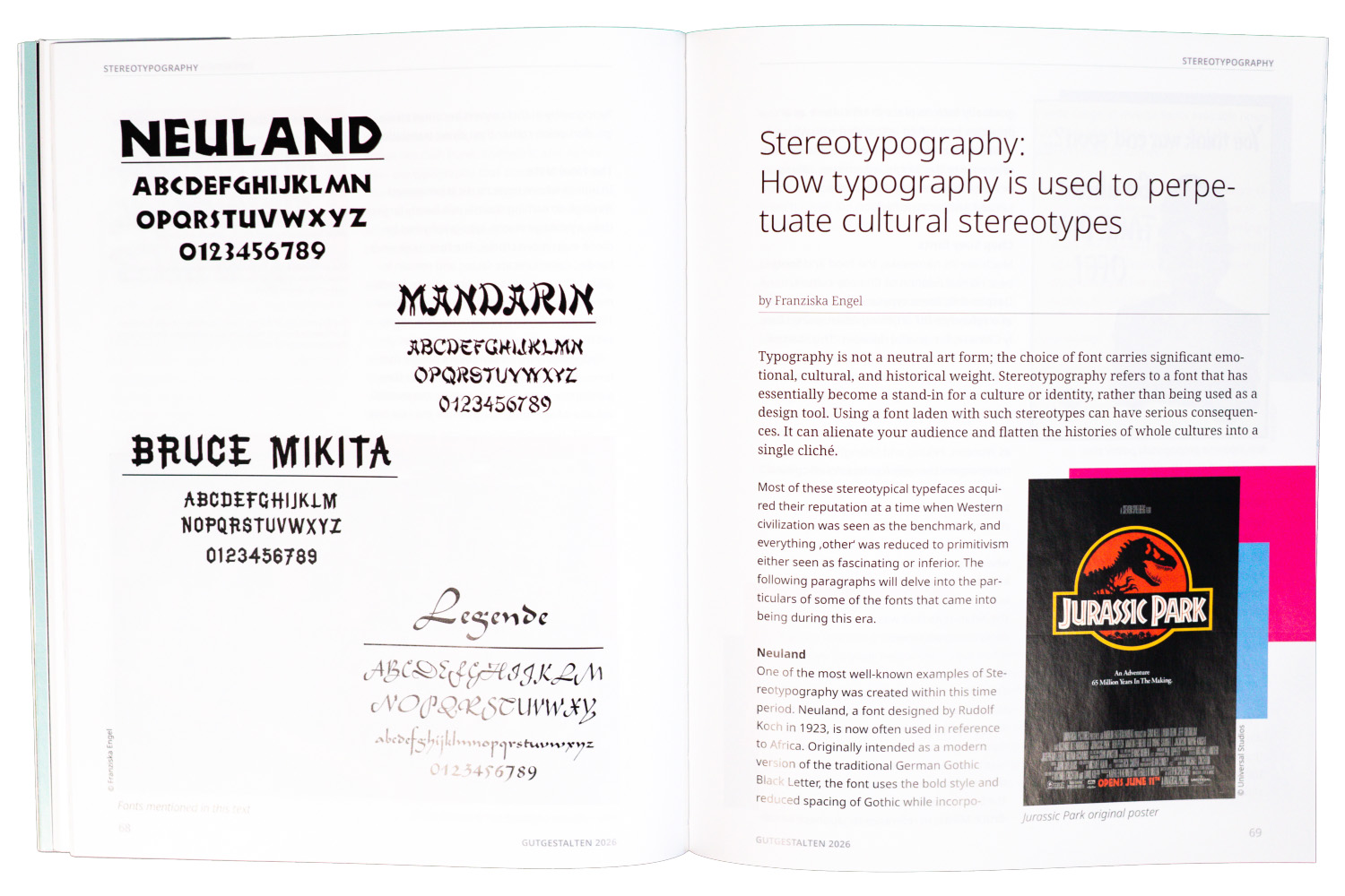
Neuland
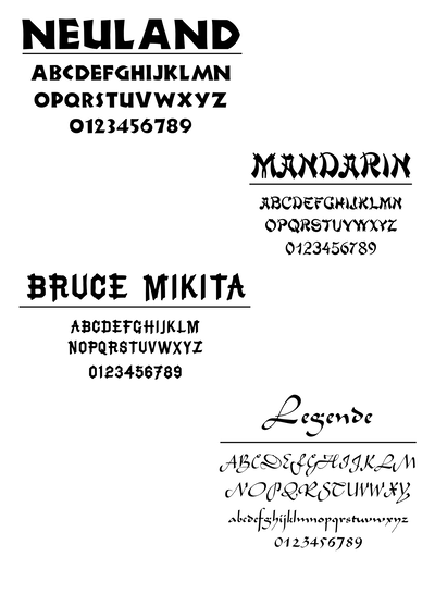
One of the most well-known examples of Stereotypography was created within this time period. Neuland, a font designed by Rudolf Koch in 1923, now often used in reference to Africa. Originally intended as a modern version of the traditional German Gothic Black Letter, the font uses the bold style and reduced spacing of Gothic while incorporating the sans-serif elements of modern typefaces. When the typeface first appeared in the US, its original meaning and the reason for its creation were unknown. Large wooden fonts, often used in circus advertising, were considered low-end and informal since they were poorly printed compared to metal type. They were referred to as 'garbage fonts'. Due to its bold and blocky nature, Neuland was considered inelegant, ugly and difficult to handle. At this time, the black American population did not have the means to cultivate its own graphic style and was reduced to being illustrated as circus freaks or in association with slavery, tobacco, and cotton. Thus, Neuland gradually took its place in US culture as a primitive font, often associated with Africa. Well-known examples that use this font in reference to the jungle, adventure, safaris or Africa in general include film posters for Jumanji and Jurassic Park.
Chop Suey fonts
Much like its namesake, the food and fonts bear no real relation to Chinese culture. Despite this, these typefaces have been used as a reference for anything Asian, particularly Chinese, for several decades. This started with the Cleveland type foundry obtaining a patent for calligraphy-style printing type in 1883, later becoming known as the 'Mandarin' font. Variations of Chop Suey fonts are commercially distributed under names such as Wonton, Peking and Shanghai, amongst many others that appropriate Asian culture. These fonts have been used to amplify xenophobia in Western society for over a century. The original Chop Suey font became popular in San Francisco's Chinatown district, where a poster following the 1906 earthquake led to its rise to fame. When the district was specifically rebuilt to appeal to tourists, the Asian-style font was chosen for storefronts to attract crowds.
Bruce Mikita
Created in 1866 at the Bruce Type Foundry, this font is the first known example of Stereotypography. Initially known as Novel Open, it was used for official documents but was soon renamed Rustic Shaded in accordance with its rustic style. But in the 1950s, the font underwent another name change: Bruce Mikita, in reference to Japanese woodworking. From then on, it was used in a lot of Japanese media in the USA. An example of this can be seen on the cover of a Japanese music album released in 1963 called The Art of the Koto: Music of Japan. Interestingly, the French cover did not feature the Mikita font, but the US cover did.
Legende
Another example of a font that has lost its original meaning is Legende, which was created by Schneidler in 1937. Though originally inspired by 15th-century Burgundian and Flemish bastard script, it is now commonly used as an imitation of Arabic script. Contributing to this is the calligraphy-like nature of the font, which reinforces the stereotype of Arabic or Oriental script as calligraphy.
Closing: Our responsibility as designers
As designers, it is our responsibility to choose fonts that convey information accurately without perpetuating stereotypes. With such a wide range of diverse fonts available nowadays, it is easier than ever to find one that doesn't resort to clichés. the font, which reinforces the stereotype of Arabic or Oriental script as calligraphy.
"These sorts of fonts are offensive to the group stereotyped, but also to the viewer. We are intelligent beings with the capacity to read the intent of a sign without designers resorting to negative stereotypes."
Nichole Fernández