75% OFF - SHORT TIME ONLY

DE

Ein Beitrag von

Elin Holmqvist

Beitrag Elin Holmqvist
Elin Holmqvist Portrait
© Timo Oberdorfer
Mehr über die Autorin ↓

Warum genau dieses Thema?

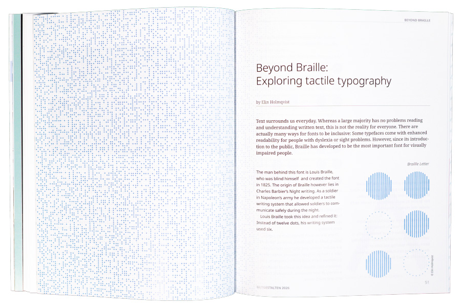
Das System hinter Braille hat mich schon immer fasziniert. Wie schafft man es, eine Schriftart aus nur 6 Punkten zu entwickeln, und zwar so, dass sie leicht zu lernen und auch wirklich nur haptisch zu lesen ist? Und ist Braille die einzige Schriftart, die auf haptischer Ebene funktioniert?

Fun Fact über dich?

Ich kann Marketing-Gags und coolen Verpackungen nicht widerstehen. M&Ms mit Cookie-Dough-Geschmack? Limonade mit Spongebob-Branding? Barbie-Müsli? Wird sofort ein den Einkaufskorb gelegt. Meine Mitbewohner:innen meinen auch immer, dass sie ohne mich nicht wüssten, dass solche Produkte überhaupt existieren :)

Wie findet man dich online?

@elinholmqvist_ auf Instagram

Beyond Braille:

Exploring tactile typography

Text surrounds us everyday. Whereas a large majority has no problems reading and understanding written text, this is not the reality for everyone. There are actually many ways for fonts to be inclusive: Some typefaces come with enhanced readability for people with dyslexia or sight problems. However, since its introduction to the public, Braille has established itself to be the most important font for visually impaired people. 

Night writing and the origin of Braille

The man behind this font is Louis Braille, who was blind himself and created the font in 1825. The origin of Braille however, lies in Charles Barbier‘s Night writing. As a soldier in Napoleon‘s army he developed a tactile writing system that allowed soldiers to communicate safely during the night.

Louis Braille took this idea and refined it: Instead of twelve dots, his writing system used six.

Braille Letter Illustration
© Elin Holmqvist

The design of Braille

While common print fonts can be used with parameters such as font size in mind, this is simply not possible with Braille. For Braille to work perfectly it needs to fit under the reader‘s fingertips.

This allows readers to quickly move from one letter to the next. In Braille, every distance, no matter if in or between cells, is defined. This is crucial for Braille readability since uneven spacing, too little or too much spacing can make it harder or even impossible to read Braille.

This strict standardization leaves little room for design variations, since Braille always has to follow the format guidelines of each country.

Spacing of Braille
© Elin Holmqvist

There are no such things such as capital letters, bold or italic fonts. Instead, symbols are added before and after the text to indicate a change in type. However, within these guidelines there is no limit to creativity. Like common text, Braille has levels of headings, a variety of text elements, footnotes, captions and much more.

Braille alternatives

Besides Braille there are also other tactile typographies that were created for visually impaired readers.

Just ten years after Braille the Boston Line Typeface was developed. This approach stemmed from the Roman alphabet with the ulterior motive of being readable to both sighted and blind people. 

The same idea applies to the Moon System of Embossed Reading, which used simplified symbols based on the Latin script.

Letter „A“ in Boston Line Typeface
© Elin Holmqvist

Why Braille became standard

However these typefaces came with the issue that they were too challenging and complex. The blind community ultimately rejected these alternatives, since these typefaces did not consider their needs. 

Nonetheless, supporters of the Moon writing argue that it is easier to use. This is mostly the case for people that have acquired a visual impairment later in life and are familiar with common letters.

New concepts

Over the past few years different design studios, graphic designers have experimented with tactile fonts: From works that play with the colors and shapes of the dots and thus explore the visual side of Braille to new writing systems.

Braille Type

German designer Simone Fahrenhorst created an alphabet that blends Braille with normal print and prepares elderly people for reading Braille. For this font to work, Braille and common letters are designed to fit in the same grid.

Letter „D“ in Braille Type by Simone Fahrenhorst
© Elin Holmqvist
Letter „S“ in Greg Bland‘s Kobigraph
© Elin Holmqvist

Kobigraph

A rather unknown concept is the „Kobigraph“, originally developed in the 70s but redesigned in 2014 by Greg Bland. This concept is best described as a typographic bridge between Braille and printed fonts. The Kobi Serif can be drawn without lifting the pen from the paper and can be understood by blind and sighted people likewise.

Braille Neue

Then there is also Braille Neue which combines Braille with common letters. The aim of this project is being able to communicate with sighted and visually impaired users at the same time using the same medium. Since the use of Braille is often limited in public spaces due to space constraints, Designer Kosuke Takahashi hopes that this project leads to Braille being used more frequently. The font is based on Helvetica and is currently available in the Latin alphabet and the Japanases alphabet.

Braille Neue Letter "N"
© Elin Holmqvist
Elia Frames‘ Letter „E“
© Elin Holmqvist

ELIA Frames

When thinking of new tactile systems, the ELIA frames immediately come to mind. Developed by the ELIA, this project aims to provide an alternative to Braille. Because even though Braille is the most used font for people with visual impairments, only less than 1% of blind people are able to read it. The ELIA frames are based on the Roman alphabet. According to ELIA they can be learned in less than three hours. Since the font is based on the Roman alphabet, learning the typeface builds upon prior knowledge of common letters and is therefore also easy to learn for people without visual impairments as well. Contrary to Braille, ELIA frames can also be printed in different sizes and can therefore also be adapted to the readers needs.

The importance of inclusion

Inclusion is an important aspect of design. It is at the center of human centered design and combines usability, accessibility and inclusivity. Accessibility is the most crucial step to inclusive design and means that everyone can use a service or product, regardless whether they have a disability or not.

However, inclusion can only happen if the people that the product is designed for are part of the conversation. Take the Boston Line Type face as an example. While the idea was to design a font for visually impaired people, it ultimately failed to address the needs of blind people. 

While this happened more than a century ago, inclusion in design remains a widely debated topic today and for it to happen, the people affected by it have to be at the center of the whole process.

If inclusion is made right, more people can contribute to new ideas. Diversity makes new perspectives possible and ultimately, leads to a better life for everyone in society.

Copyright 2026. All Rights Reserved.
Einstellungen gespeichert
Datenschutzeinstellungen

Hinweis: Dies ist eine Vorlage. Bitte passen Sie den Text an Ihre spezifischen Anforderungen an:
Wir verwenden Cookies und ähnliche Technologien, um Ihre Erfahrung auf unserer Website zu verbessern. Einige Cookies sind für die grundlegende Funktionalität erforderlich, während andere dazu beitragen, die Nutzung zu analysieren und unsere Dienste zu optimieren. Detaillierte Informationen finden Sie in unserer Datenschutzerklärung.

Technisch erforderliche Cookies werden immer geladen.

Hinweis: Bitte passen Sie den Text an Ihre spezifischen Anforderungen an.
Eine Übersicht der verwendeten Theme-Cookies finden Sie in der Dokumentation. Wir empfehlen, diese hier oder in Ihrer Datenschutzerklärung aufzuführen.

You are using an outdated browser. The website may not be displayed correctly.